"The danger is not that America will collapse into a Depression tomorrow... The danger is that the paralysis of the American political system - its inability to tackle any big multigenerational problem anymore - will just very slowly erode our strengths and assets as a society. We will slowly choke off immigration, slowly give up our commitment to free trade, slowly allow the budgets for research in science to decline, slowly let our public schools slide into mediocrity, and only slowly face up to our energy challenge."
Thomas L. Friedman
Hot, Flat, and Crowded, p20, 2008
Friends are a blessing. The blue striped yardage from Kaja that was used to bind the Froggy Star reminded me of Tethys Waves because it's in the same family of blues. There's enough to appliqué triangles over those gaping white triangles on the sides. But then... Thinking about the AHIQ flower challenge, a better solution presented itself. You guessed it. Flowers. A small bit of red batik scrunched under some larger pieces lurked in my stash. Ah, the joys of cleaning house... Well, at least of cleaning the sewing room.
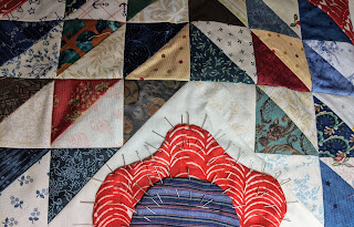 |
| Half flower pinned on the sides |
Can you tell I don't appliqué much? That's a lot of pins. But this time I wanted to see the result before sewing everything. See, this old dog can learn a new trick. After pinning three red petals and adding a blue center to one I can tell the idea works. It tones down the gaping white triangles while blending with the floral theme of the red squares.
 |
| Half flowers added to Ocean Waves |
It's only eight half flowers. How long could it take? Knowing myself, much too long if handwork was involved. So these were blanket stitched by machine in matching thread. Done it a couple of hours.
 |
| Tethys Waves quilt top with side flowers |
Now to find a back. And consider whether or not to add a border. And figure out a quilting design that won't take the rest of my life.
Off the Bookshelf
 I enjoyed the Lady Astronaut series so much I picked up Shades of Milk and Honey, too. It's the first of an older series by Mary Robinette Kowal set in Regency England with a small twist - magic exists. Threads of glamour can be pulled and twisted to created visible images. Young ladies of quality are expected to practice this talent along with painting and music.
Mary credits Jane Austen as her inspiration. While not as complex and deft as Jane's novels, it is an intriguing read that reminded me of Rick Riordan's first book, The Lightning Thief - another clever first book developing a coherent alternate world - that should improve throughout the series. Definitely worth the time.
Enjoy the day, Ann
Off the Bookshelf
 I enjoyed the Lady Astronaut series so much I picked up Shades of Milk and Honey, too. It's the first of an older series by Mary Robinette Kowal set in Regency England with a small twist - magic exists. Threads of glamour can be pulled and twisted to created visible images. Young ladies of quality are expected to practice this talent along with painting and music.
Mary credits Jane Austen as her inspiration. While not as complex and deft as Jane's novels, it is an intriguing read that reminded me of Rick Riordan's first book, The Lightning Thief - another clever first book developing a coherent alternate world - that should improve throughout the series. Definitely worth the time.
Enjoy the day, Ann


