Showing posts with label SFO museum. Show all posts

Tuesday, September 24, 2019

Lone Star Quilt Reprise

I finished the second one this week. The last of the red print makes the star points and I quite like how lively the lone star looks on the pink.

Printed cotton in three shades of blue, two shades of green, red, and yellow form a modern Lone Star that rests on a bright pink background.
Lone Star quilt 5

Here's how I started the center. I thought the green would work but it wasn't strong enough. The navy blue print is better.

Two collaged photos show two different arrangements of fabrics. On the left the center is red and light green surrounded by darker green and yellow diamonds. On the right the center is dark blue and red surrounded by either the same dark green and yellow or a very light blue.

Next I tried moving the reds. Across the star points or down them? Should the outer row be green or navy or alternate?

Two collaged photos show bright red prints lined along the spine of the stars or across them.

Or perhaps it should be navy and light blue. Do the inside of the star points look better with dark or light greens and blues? Taking photos helps decide which looks best. Aren't we lucky to live in the digital era!

Two collaged photos show the center star of alternating navy and dark red on the left and medium blue and red on the right.

Finally I tested several borders. Of course, that blue with the green print border was my favorite but there's not enough. And this quilt is for a girl. The pink is a shocker but in a good way.

Both the pink print and a combination of light blue print bordered with a dark olive green print are arranged on the design wall for consideration.
Possible borders for Lone Star quilt 5

Again I started this spiral with orange peel arcs in the center of the star then completed a circle around them. After that, a quick off-ramp starts the spiral.

The center star of the Lone Star is machine quilted with FMQ orange peels and then switches to echo quilting in a spiral for the rest of the quilt.
Quilting detail

Here's a view of the back. The quilting doesn't show up as much on this print as it did on the solid of the previous quilt but it works well with the greens on the front. A navy print finished the binding.

The folded quilt shows front, back, and binding. The back is large purple flowers on olive green and the binding is a navy floral cotton.
Detail of front, back, and
binding of Lone Star quilt 7

Done and dusted. Who'd have thought? But now DH will think I can pull this off any time.

Quilt Details
Size: 40" x 40"
Design: Lone Star
Batting: Pellon 100% cotton
Thread: Metler fine embroidery pink cotton
Quilting: Spiral with walking foot

Approximate Yardage: 3.75 yd

The next day I flew out to see my daughter. SFO has wonderful exhibits in their terminals. This time they displayed California Studio Craft from the Forrest Merrill collection featuring work from the 1940s to the present including sculpture, pottery, paintings, textiles, and furniture. Studio craft combines handmade crafting with fine art. Precursors to the American Craft Council and the NYC Museum of Arts and Design raised the professionalism of the artists and increased the popularity of the movement which really took off after WWII with the use of the GI Bill.

Bowl and Tile by Beatrice Wood, 1940s

The graceful lines of the legs attracted me. I wonder if it's as comfortable as it looks.

Hammered and soldered copper Sixes by Merry Rink (1976) with shedua and leather Wishbone chair by Arthur E Carpenter (1972)
Hammered and soldered copper Sixes
by Merry Rink (1976)
with shedua and leather Wishbone chair
by Arthur E Carpenter (1972)

Mr. Merrill collected at least two artists' work over the years. The exhibit highlighted how each worked on a simple design in series.  First, John Lewis created lunar themes with his glassworks.

Blown glass Moon Bottle (1970) and Moon Bowl (1972) by John Lewis
Blown glass Moon Bottle (1970)
and Moon Bowl (1972) by John Lewis

These two bowls by Kay Sekimachi show the progression of her work. The 1990s bowl is laminated handmade Japanese paper with bark and straw combined with linen thread inclusions. By 2014 she laminated much more delicate maple leaf skeletons adding watercolor and Kozo paper. These two demonstrate how working in a series builds our skills.

Two delicate pieces made with Japanese paper. Bowl (1990s) and Leaf bowl (2014) by Kay Sekimachi
Bowl and Leaf bowl
by Kay Sekimachi

Intricate woven, embroidered, and silkscreened textiles were tucked into the corner where the curving glass picked up all the reflected lights making photos impossible.

FUR or Fabric Use Rate Update

I donated 8.25 yards to the guild this month and finished two baby quilts of 3.75 yards each so my total FUR is 15.75 yards/month or a smidge over half a yard per day. That's something to consider before I go shopping again.

Enjoy the day, Ann

Saturday, August 18, 2018

Coast to Coast

On our last day in NY we walked along the High Line to the Whitney Museum. Two and a half miles of a former elevated railroad was repurposed to green space with gardens everywhere {and active volunteers working diligently}, outdoor theaters, seating areas, cafes, small shops, and this charming wading puddle. About an inch deep, the water flows two-three feet from the edge towards the center. Yes. I took my shoes off and enjoyed the experience.

The High Line, NYC

The Whitney concentrates on works by artists who work in America. Each floor had a different exhibit; Where We Are focuses of visions of 1900-1960 community, work, home, the spiritual, and the nation.

Of course, I noticed this painted map of the Brooklyn Bridge. The multiple perspectives and the highlighting of decorative elements remind me of Valerie Goodwin's work. Other's thought so, too. A large class sat in front of the picture while their guide discussed it multilingually. Stella used single point perspective but that point moves up and down along a center line. The angles of his linear features - buildings, support wires, light beams - is masterful. Especially interesting to a quilter, I think.

The Brooklyn Bridge:
Variation on an Old Theme
by Joseph Stella, 1939.

Somber pictures painted in tempera on composition board mark Jacob Lawrence's service in WWII Coast Guard. The sailors in open air marching up the gangplank for another patrol carrying supplies as big as they are complements the stifling closed deck sleeping quarters as they are shipped out. You can feel the cool breeze in the first and the humid, stifling heat of the second.

War Series: Another Patrol, 1946 and
War Series: Shipping Out, 1947
by Jacob Lawrence.

The exhausted soldier packing all his gear drops his head. No exuberance here; he's experienced too many horrors and lost too many friends. All he feels is relief the mayhem is over.

War Series: Victory
by Jacob Lawrence, 1947.

Photos of night scenes never come out for me but I'm almost always enthralled by painted views of expansive night skies contrasting strong moonlight with a small human-made light. Beautiul dark blue sky with many stars. A full moon reflected on snow brightens this Adirondack farm. The lit window in the deep shadows is both welcoming and tiny - having more warmth although only a pinprick against the moon's strength

Moonlight, Winter by Rockwell Kent, 1940

It reminded me of this picture from the Denver Art Museum last year. I wanted to include it then but he's smoking. Still, there are many features in common. Dark blue night sky full of stars; a full moon not visible in the picture reflects on the white horse and brightens all the land. The tiny human-made light, a cupped match, seems to add a much light as the moon by brightening the cowboy's face and shirt and drawing our attention.


Sadly I don't know the name of the painting or the artist. I've checked my records and the museum's. Please let me know if you discover either.

The rainfall differences are immediately apparent between the two paintings. Since John Wesley Powell identified the 100th meridian west as the divide between the humid east and the arid west this line has been a visible boundary between rainfall and desert, between corn and wheat, between population density and scarcity. Recently the line has moved east. Only one degree of longitude. Just to the 99th meridian west. Guess what? That's about 78,000 square miles in the US alone.

Only fifteen of our states have more area. Or... 82 of 192 countries. Not an insignificant effect of climate change. What will we leave for our grandchildren?

Once again the San Francisco airport has a unique exhibit in the terminals. This time it's Maneki Neko, the Beckoning Cats of Japan.

Meneki Neko, the Beckoning Cats of Japan
at the San Francisco airport museum

Scholars believe cats came to Japan from Korea in the 8th century. Valued because they killed rodents, cats quickly became pets and appeared in art and literature. During the late Edo period (18th & 19th centuries) artisans began making these figurines with upraised paw to attract people to businesses and homes. The left paw brings good fortune to a business while the right paw attracts fortune, health and happiness to a home.

The cats vary in color, size, facial features, tail length, and bib decoration. They are made of stoneware, porcelain, wood, stone, and metal. While playing Go, the wooden pair below imitate two of the seven gods of good fortune - Daikoku and Ebisu.


Perhaps you recall Google's AI program won against a Chinese grand champion last year. Artificial intelligence researchers like this game because it has many more outcomes than other board games such as chess. In fact, Google says "there are more potential positions in a Go game than atoms in the universe."

Enjoy the day, Ann

Saturday, July 22, 2017

Another Border

CCII Continues

I thought this was my own design and then realized it's only a variation of Sujata's Endless Mountains directions. A stack of half WOF nine-inches wide cut into long narrow triangles, then moved so different fabrics show in each row.
Stacked fabric for outer border CCII

Trying to be cautious, I considered a single color for these pennants. It's not lively enough to suit me.

CCII green outer border

So then I repeated the method with more colors. I think I like this better. But it still feels like it needs a different color. Not sure which that is.

CCII multicolored outer border


SFO Exhibit


Traveling home I took the time to view an exhibit of typewriters at SFO. As usual, educational, well-arranged, thought provoking. They included three free-standing arrangements of typewriters, copy/book, photos, and carrying cases by famous writers such as Orson Welles. {Think War of the Worlds.} Seeing the authors' work highlighted the connection with his typewriter.

These are index typewriters, an early portable, from the late 1800s.  The silvery Odell in front printed upper and lower case letters by pairing the sliding index with shift and selector keys.  Typists must be letter perfect since the typed page is not visible until it's finished.

Index typewriter: Odell Type Writer No. 4
c. 1900 by Farquhar and Albrecht, Chicago

Another style used type-shuttles which allowed the user to convert from one language to another. The cylinders rotate into position and are struck by a hammer to type the letter onto paper.

Type-shuttle typewriter: Hammond 1B
c. 1890, The Hammond Typewriter Co., NY

The Oliver No. 5 featured typebars high and to the side. I'm not sure what the pencil was for but the typebars remind me of old folding plate cameras. I read an amusing comic by Mike Peters last month on a similar topic.

Lateral down strike typewriter: Oliver No. 5
by Oliver Typewriter Co, Chicago, 1913

The 1936 Corona from was my favorite. Designed to teach children to read, the keyboard is covered with animal pictures rather than letters.

Child's typewriter: Corona Standard with
Animal Keyboard 1936, SFO exhibit

Enjoy the day, Ann

Saturday, June 24, 2017

Inner Border Finished

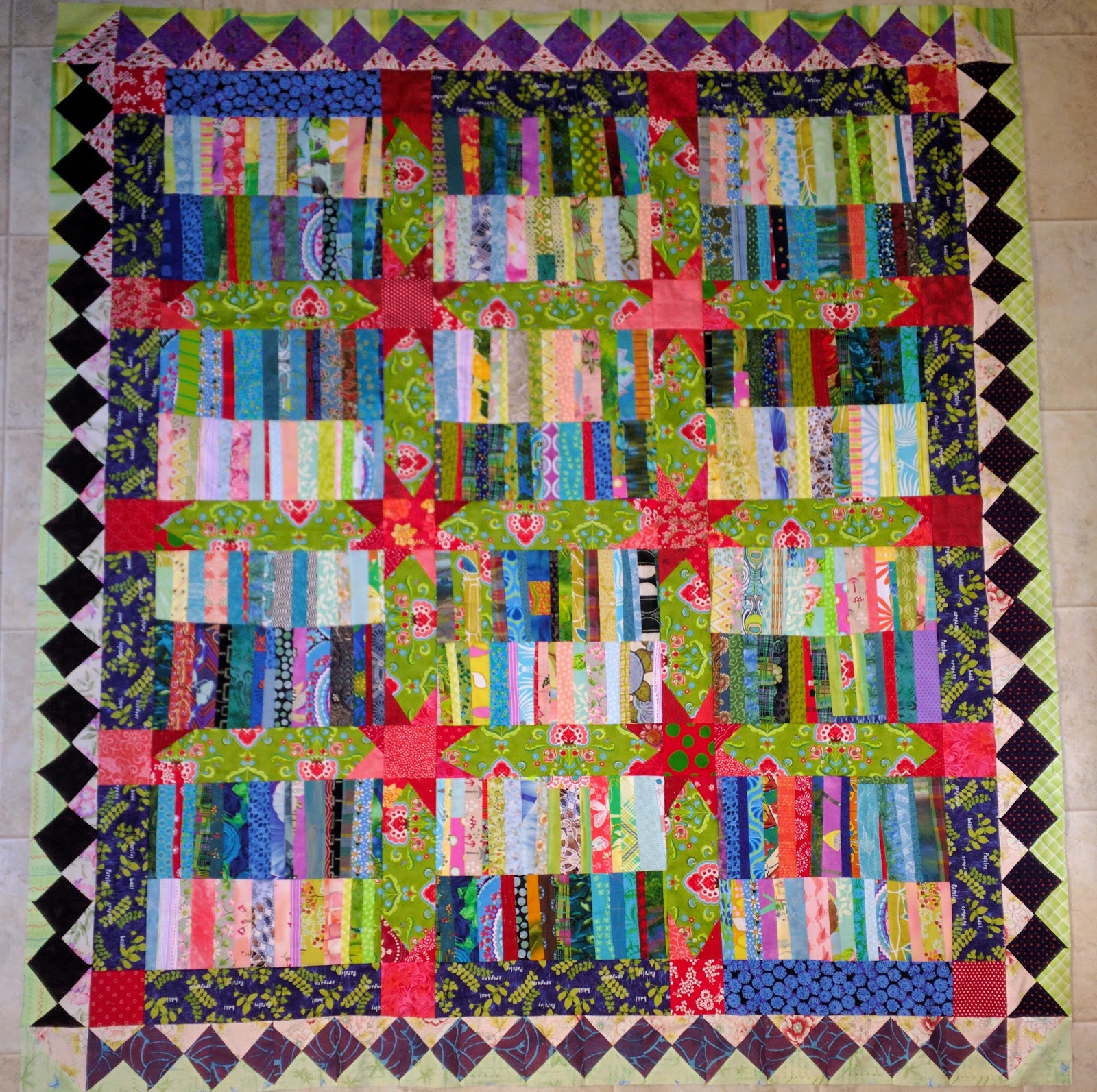
The diamond shapes are four different darks: two purple, one black, and one navy. I like the variation although I was hesitant at the beginning. But what else can you do when there's not enough of any one fabric?

First border on CCII

Here's a close-up of the navy. It's hand-dyed fabric from India and colorfast. When the commercial fabric is this dark, it usually causes me problems so this is a welcome change. The fabric has a more textured feel and drapes well. That made me think about the mercerization and other finishing processes on many commercial fabrics.

Navy hand-dyed Indian fabric

Of course, now it  needs another border. I plan to try some of the ideas I posted last month... After a short vacation.

SFO had a new exhibit after we passed security: Games of Chance. I don't gamble {don't enjoy it} but found this exhibit of the development of coin operated machines quite interesting.

The first automatic-payout, three-reel machine was invented in 1898 San Francisco by Charles Fey. Customers couldn't calculate the payout percentage because only three symbols of the Liberty Bell's 1000 combinations showed at a time. More advantage to the house.  Charles also added bell sounds to his machine, a move copied by almost every other manufacturer since.

Liberty Bells are permanently commemorated with a historic marker at Battery and Bush. I've seen the marker and laughed at what people memorialize.

Liberty Bell mechanical game

The exhibit continued with games involving dice under glass bells {which looked like something in a physics lab}, wheels made like bicycles,  and elaborate enameled machines.

War Eagle and Horn of Plenty
enameled slot machines
with a bicycle wheel of fortune machine

The exhibit culminated with life size one-armed bandits. Frank Polk carved the cowboy in the 1940s, possibly as a self portrait.

One-armed bandits from the 1940s-70s

Enjoy the day,  Ann