Saturday, July 22, 2017

Another Border

CCII Continues

I thought this was my own design and then realized it's only a variation of Sujata's Endless Mountains directions. A stack of half WOF nine-inches wide cut into long narrow triangles, then moved so different fabrics show in each row.
Stacked fabric for outer border CCII

Trying to be cautious, I considered a single color for these pennants. It's not lively enough to suit me.

CCII green outer border

So then I repeated the method with more colors. I think I like this better. But it still feels like it needs a different color. Not sure which that is.

CCII multicolored outer border


SFO Exhibit


Traveling home I took the time to view an exhibit of typewriters at SFO. As usual, educational, well-arranged, thought provoking. They included three free-standing arrangements of typewriters, copy/book, photos, and carrying cases by famous writers such as Orson Welles. {Think War of the Worlds.} Seeing the authors' work highlighted the connection with his typewriter.

These are index typewriters, an early portable, from the late 1800s.  The silvery Odell in front printed upper and lower case letters by pairing the sliding index with shift and selector keys.  Typists must be letter perfect since the typed page is not visible until it's finished.

Index typewriter: Odell Type Writer No. 4
c. 1900 by Farquhar and Albrecht, Chicago

Another style used type-shuttles which allowed the user to convert from one language to another. The cylinders rotate into position and are struck by a hammer to type the letter onto paper.
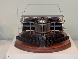
Type-shuttle typewriter: Hammond 1B
c. 1890, The Hammond Typewriter Co., NY

The Oliver No. 5 featured typebars high and to the side. I'm not sure what the pencil was for but the typebars remind me of old folding plate cameras. I read an amusing comic by Mike Peters last month on a similar topic.

Lateral down strike typewriter: Oliver No. 5
by Oliver Typewriter Co, Chicago, 1913

The 1936 Corona from was my favorite. Designed to teach children to read, the keyboard is covered with animal pictures rather than letters.

Child's typewriter: Corona Standard with
Animal Keyboard 1936, SFO exhibit

Enjoy the day, Ann

32 comments:

Ariane said...

That's a great border. I would add more blue in your border. It's going to look amazing though. I love the typewriters.

Julierose said...

I think borders are difficult; it always takes me forever and a day to figure one out...I like that triangle idea a lot hugs, Julierose

Quiltdivajulie said...

I like that border design! But the bright yellow triangle feels out of context with the other colors in the quilt ... At least it does to me seeing only the partial photographs. I adore old typewriters - what great photos!

KaHolly said...

Your quilt is going to be spectacular!

Marly said...

I like the green and neutral triangles, but think it's rather subdued in comparison to the riot of colour in the centre; the second fits the mood better. If I were you I'd just continue adding more colours as you go. There's room for aqua and more blue in there too.

Monica said...

In general, I think that more fabrics are better. You have some pretty lights in this border!

Personally, I was deeply relieved when computers made typewriters obsolete! But I have not seen many of those old ones, and it is interesting to see how they came up with mechanical solutions for cognitive functions back then!

O'Quilts said...

nice post...great quilt project

Mystic Quilter said...

Love the multi fabric border best Ann, compliments the body of the quilt beautifully.

Ann said...

Thanks, Ariana. I found a few blues but need to look for more

Ann said...

I usually find borders easy but these last few haven't been. I think I may use these sawtooth borders frequently.

Ann said...

The single yellow bothers me until it doesn't. Back and forth. Ah, well. Something to consider.

Ann said...

Thanks, Karen.

Ann said...

I agree the greens are subdued. The multicolor may be too bright. I need to pull more cool colors.

Ann said...

I was channeling you and Linda when I chose the lights. Soft, flowery, feminine.
I was delighted to end the white-out era. I even remember erasing that thinned the paper. But we've just found more stuff to save.

Ann said...

Thanks.

Linda @ kokaquilts said...

Love seeing the differences as you work this out! I like the multi fabric look with this border too. I guess it depends on what effect you what, would more blue in the border carry over the blues happening in your centre coins piece?

Ann said...

Thanks, Maureen. I think I do, too. Then change my mind.

Kaja said...

I like these triangles a lot, agree with your feeling about the first version and am wondering, like Linda, if maybe a bit more blue is what you need in the mix. I loved my typewriter even though it's all so much easier now.

Ann said...

It is interesting to see how the border changes with different colors. I'm curious what blue will do.

Ann said...

Yes. I cut some red but wonder if I should have added blue instead. Nothing has seemed quite right.
I wish I'd kept my manual typewriter.

Cathy said...

And if you didn't happen to have Sujata's book...it would be your original design! (I think it still is since we are inspired by many things and don't even know where ideas come from a lot of the time).

I'm not one to ask about borders. I rarely audition anything because I can never decide what looks right. when I was working I used to say I only made decisions at work and not at home. Not sure what my excuse is now. Anyway...I like the scrappier border and think it needs more blue too since that seems to be predominant in the quilt.

I have a couple of old typewriters in the attic. One is manual that I bought from a pawn shop and took to college. It has someone else's initials on the hard case - probably the initials of the person who pawned it. I typed many a term paper on it. Memories....

Ann said...

I used to type term papers for cash. Memories.

Janie said...

I learned to type on my dad's old typewriter, I enjoyed the mechanical aspect of it. I could look inside and see the innermost workings of its guts. Keyboard typing is not the same.
Your piecing looks good, I can't wait to see what you finally decide on, borders can be a challenge.

Ann said...

Sorry. I hit publish too soon. I love borders and used to find them very easy to add. Never seemed to run out of ideas. I also like that they give a place and way to change the design,units, and colors. It's been much harder the last few year. Not sure why.
I do like the scrappier border on its own but have some doubts when I step back and look at the entire quilt. Is it the shape or colors? I'll keep working and thinking.
Wishing you and your family a restful summer.

Ann said...

That's a part I enjoyed, too. My brother used to try to stop or delay the hammers from striking. Crazy.
This border is challenging me more than I ever thought.

Mel Beach said...

Super fun border progression. Thank goodness for design walls to audition and experiment with different color combinations. Look forward to watching your quilt transform once the borders are finalized!

Mary Marcotte said...

The scrappy border is more interesting but I think I would break upper the clusters of similar colors or add in several clusters. I'd probably prefer clusters simply because it's different and gives you opportunities to use the clusters to add or detract from other components. What a great quilt you have going!

Audrey said...

I'm actually wondering if you need to keep the row of greens but mix up the colors for the other pennants instead of just using the lights. Maybe even flip the greens to the outside edge? Borders are more challenging when we care more about how much value they bring to the quilt.😊

Ann said...

This would have been a mess without the design wall. I've changed my mind so many times... and it doesn't work as well as it used to. Ha!

Ann said...

What a clever idea. Thanks, Mary.

Ann said...

Alternating green on one side with all the other colors on the other is an idea I hadn't considered. Borders can add so much and give us a place to change the tempo like the different movements of a symphony. Thanks for the idea, Audrey.

Shelina said...

I wonder if that spot where the pencil is was meant for the eraser. I remember white pencils that had a brush on the other end that was supposed to erase typed copy. I typed term papers in high school and college too, and a little bit afterwards.