Tuesday, May 7, 2019

Using the Extra Blocks

I didn't intend to reprise The Square Deal so closely but, while clearing up, four sets of HSTs already sewed into nine-patches surfaced. They surprised me so I dug around extensively but didn't find any more. These are the last of this combination and I need several baby quilts. Soonest! So here we are, choosing between two very similar white prints for the center cross: frogs in a pond or sea creatures.

Comparing two white prints as the central cross in The Square Deal quilt block.

At the last minute I added the squares to make a Churn Dash center again. It makes the center more interesting; however, the inner border is blue {instead of white.} A small change.

Final decision: which print for the outer border? My first thought was the lovely one at the bottom but after looking at the photo, the triangle print floats my boat. Why does it look better? When it was in the box, the colors looked quite different than the center blocks. Viewed through the reducing lens of a camera, it changed appearance somehow. It has a richness the other lacks.

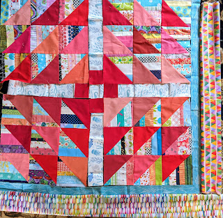
Components of The Square Deal are arranged with a narrow turquoise inner border and two choices for the outer border. Both are multi-colored. One is made printed of small rectangles and the other of small triangles.

After looking at this photo for a few days, I've decided the scale of the right border relates to the center better than the bottom border. They are nearly the same colors but the slightly larger design on the right gives them more presence. What do you think?

Enjoy the day, Ann

30 comments:

Julierose said...

Love those sea creatures; soft prints with white backgrounds are hard to find...and I like how they can be used to blend in with more vibrant blocks--nice choices...hugs, Julierose

Marie said...

So cute! Good choice on the border - it's just that much stronger. Isn't it great to be able to use up those extra HSTs so quickly?

patty a. said...

This is going to be another pretty baby quilt! I like the border on the right since the angles of the design coordinate with the angles in the center.

JanineMarie said...

The right looks more lively, I think, and the tiny triangles echo the ones in the center. I love the bottom print, but the purplish tones are what stand out to me, which don’t seem right for this quilt. I have used that print before as a binding, and loved it there.

Nann said...

You rescued the string triangles from orphanhood! The wavy/ombre effect of the bottom border print pulls the eye away. The triangle print is static and frames the blocks.

gayle said...

I agree with your call - that triangle print is The One!

Robin said...

You are quite the improviser. I like the triangles on the right too.

Helen L said...

love how you created the churn dash block in the center!!

Ann said...

You are so right. I've started collecting prints with white backgrounds. There are more recently than I've ever seen. I used to have to use beiges and tans to get any diversity.

Ann said...

I'm thrilled to use these up right away rather than storing them indefinitely. Thanks for confirming my opinion of the border options.

Ann said...

That's a good point that I hadn't considered, Patty. It amazes me how much better it looks in the preview than it did in the stash.

Ann said...

Good point about the purple tones in the bottom border. I loved it in the stash but it just looks wrong here. Thanks for the suggestion to use it as binding, Janine Marie.

Ann said...

Yes! It makes me so happy to use these up immediately rather than storing them. I hadn't thought about the wavy effect of the bottom border but agree with you. Good eye, Nann.

Ann said...

Thanks, Gayle.

Ann said...

Isn't it funny how differently things look when we actually preview them with the rest of the top? A good lesson.

Ann said...

Thanks, Helen. I used the churn dash on the previous one and liked it much better than leaving the center as white rectangles. It adds interest.

Claire said...

I too agree with your border choice. Warm colors dominate in it, whereas the bottom row seems more evenly divided among warm/cool. I think the warm enhances your red-orange triangles which are dominant.

audrey said...

Yes to the fabric on the right! Love how it echos the inside quilt shapes or at least ties in with them. Plus, it's a stronger graphic which looks/feels right. Your churn dash in the center looks so good. Wonderful that the triangles in the very center are not all identical. Adds that charming vibe that the best make-do quilts thrive on!

Barb said...

What a lively and fun quilt. That churn dash in the center is so charming!

Cathy said...

I'm not a good judge of border fabrics since I rarely add borders but if I was going to dither I would have to see each border fabric individually around the quilt and not both together. I get a sense that the bottom fabric emphasizes more the string/strip background and kind of extends the background out to the border and leaves the reds to stand out and the fabric on the right emphasizes the sharp angles and bold red. But I don't dither or usually add borders and don't usually have many choices. Anyway...either are splendid.

Janie said...

Fun with color! Good choice for baby quilts, very happy prints and colors.

Ann said...

Thanks for pointing that out, Claire. The center is warmer than I thought.

Ann said...

Sometimes I can be overly literal (or the visual version of that): I worried that the triangles were not HSTs in the border. Haha. You're right; the stronger graphic makes the better impact. And of course, those HSTs in the center are different because there is rarely enough of any one fabric but I'm glad others like the result.
This is a make-do quilt - those strips are all leftover from Coins that didn't work out. I love putting them to a new use - as you did with your leftover circles. Was it Dried Flowers?

Ann said...

Thanks, Barb. That churn dash adds a lot for four small squares.

Ann said...

So many good thoughts here. It helps clarify my choice. And... What a good idea to use the bottom fabric as an inner border of a string quilt. I'll remember that.

Ann said...

Thanks, Janie. I agree this makes a splendid, quick baby quilt.

Kaja said...

I'm cracking up - could have sworn I'd commented on this. In my imaginary comment I said I liked the triangle print, both because it echoes the central shapes and because of the touches of red. I also love the little churn dash in the middle.

Ann said...

I've done that before so we could get adjoining rooms.
The triangles look much better than I thought. I'm glad you agree. The churn dash fills it up and adds interest. It keeps me from worrying about fancy quilting, too.

Mystic Quilter said...

I love the triangle print border, you're so right in that it fits in perfectly with the centre piecing. Some lucky little one is going to have a beautiful quilt.

Ann said...

How kind of you. I will miss this quilt when it goes to its forever home but hope the child loves it.