Tuesday, July 16, 2019

Is the Tethys Waves Quilt Top Finished?

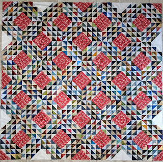
I'm uncertain whether I like this top or not. These are all the red triangles. After testing several other red fabrics I thought a cream solid looked best to fill in the missing sections. Now I'm not so sure.

Small HSTS in blues, reds, greens, golds, and creams surround the large red and white print squares
Tethys Waves, an Ocean Waves quilt top

Perhaps the cream should have been an inner round? Or perhaps it should be dark? Would applique help? Does it need a narrow cream border? I will ponder this for a while.

Meanwhile, DH and I saw the Van Gogh exhibit at the Houston Museum of Art. It was the last week and I was determined to make it. And I’m glad I did. So much in exhibitions has changed for the better. The layout made the show as much a biography, travelogue, and art history lesson as a simple art exhibit.

The curators enlarged several of van Gogh’s sketches and placed them, along with large aerial maps in each room to highlight the different areas Vincent traveled while painting. BTW, did you know he only painted during the last decade of his life and still left over 900 works?

Enlarged sketches by Vincent van Gogh cover many walls and highlight his creative journey
Enlarged sketches by Vincent van Gogh
highlight his creative journey
at the Houston Museum of Fine Arts

The exhibit brought together complimentary sketches and paintings like this pair of Montmartre.

A sketch and a painting of the same view of Montmartre by Vincent van Gogh
Sketch and painting of Montmartre
by Vincent van Gogh

It highlighted his friendship with Paul Gaugin who visited Vincent in Arles where they set frequently set their easels side by side as each painted the same scene or model. For example, Portrait of a Man (Joseph-Michel Ginoux?) by van Gogh is believed to be the proprietor of the Cafe de la Gare in Place Lamartine, Arles. A photocopy of Gaugin's painting with the same name was included on the information card. Although at a different angle, it is the same man in the same clothes with the same lime background.

The cafe owner wears a formal suit and is painted on a lime green background.
Portrait of a Man (Joseph-Michel Ginoux?)
 by Vincent van Gogh


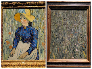
Van Gogh considered wheat a symbol of life. He used it repeatedly as the focus and background of his portraits of peasants such as this pair.

A peasant woman with a straw hat and a blue dress sits in a field of wheat in the painting on the left. On the right is a painting of a similar field of wheat.


As you all know, van Gogh was repeatedly entered an asylum near the end of his life but continued to paint there. I think The Garden of the Asylum at Saint-Remy is my favorite in the exhibit for the movement of the leaves and his masterful use of black outlining.

Two collaged photos show a portion of the painting and a detail of the brushstrokes.
The Garden of the Asylum at Saint-Remy
by Vincent van Gogh

Mel Beach's Summer Lovin' projects, with their black thread outlining and writing invoke a similar feeling in fabric.

Enjoy the day, Ann
24 comments:

Julierose said...

Isn't that always the way? When you get to the "finish" you have questions ...I am pondering also--when i added the one (really really red) rd block to fill in at the bottom--my eye is immediately drawn to it...don't know if I like it...or not...aaargh...hugs, from a dithering person Julierose

Nann said...

I think the cream looks good in the design. It picks up the lights in the HSTs. How wonderful to see such an extensive exhibit of Van Gogh!

patty a. said...

I think a darker binding could balance out the cream. No sense in spending a lot of time tearing the cream out and replacing it for a quilt you are going to gift to a baby.

You as so lucky to get to see such a wonderful exhibit!

Judy P. said...

I like the red triangles in the corners. Personally, I would put the red where the cream is, but ultimately you just need to please yourself. Isn't that wonderful?

Janie said...

Good progress on your quilt top.
What a treat to be able to see Van Gogh at the Houston Museum of Art! His use of color always speaks to my heart.

Robin said...

I am so envious that you got to go to the museum. Thanks so much for sharing this with us. I wonder if Van Gogh knows how many people he has influenced. (I guess you can tell I believe in an afterlife.) Your quilt looks beautiful. I just love the red puffs of color.

KaHolly said...

Your top is looking mighty find! You’ll figure out exactly what it needs. You always do!

Sue said...

I actually really like it the way you have done it. Makes it interesting to look at. Maybe a dark binding. Love the art work.

Mystic Quilter said...

I love the red triangles placed around the edge but not too keen on the cream ones. Could you try something darker in place of the cream, maybe pick out the colour of one of the small triangles in the quilt that is a good fit with the red and then a dark binding.

Shelina said...

Sometimes it takes a while to make a decision but I am sure you will come up with the right solution! It is a beautiful quilt! Those red squares add so much movement!

cspoonquilt said...

On the overall view I think the cream triangles make an interesting geometry. On a bed I'm not sure it would really be seen, but it's a great quilt!!! Looks like the exhibit was interesting. cheers!

Kaja said...

I can't decide about the cream, but since you don't have more red then I would agree with Patty, that maybe a dark binding would finish it nicely. Or maybe quilt the cream with a red thread? I like the quilt a lot though, so in some ways it's only fine tuning, whatever you do/don't decide.

Ann said...

We will both figure our issues out. I’m glad to not be alone.

Ann said...

That was my opinion before seeing them but now the cream just slaps me in the face.
We were lucky to see the Van Gogh exhibit. It was right in town.

Ann said...

A dark binding seems good to me, too. This quilt has outgrown a baby size but I have a friend who would like a traditional quilt with red. I’m still pondering some appliqué.

Ann said...

That would be my first choice but I used it all up and had to make a change. I couldn’t find a similar red and thought the cream would work. It needs another tweak though.

Ann said...

Aren’t we fortunate when we have time to see a good exhibit in detail? It was a great day with DH.

Ann said...

I felt very lucky to spend the day at the exhibit with DH. This one showed the development of his artistic skills and we both enjoyed seeing the different styles Van Gogh embraced.

Ann said...

Thanks, Karen. It will just take some time and thought.

Ann said...

Thanks, Sue. It shows the block better but I fret about the cream. Dark binding seems the way to finish it.

Ann said...

That's one of the ideas in Co Sider I g although I'm not thrilled about changing out the triangles. Plus, I thought I'd like this and don't so I'm not convinced it will be as simple as changing the value. I'm going tofild some fabric into place and take lots of photos. But dark binding seems to be the best.

Ann said...

Thanks for the encouragement. I just do t see an answer yet

Ann said...

They do change the look of the design. Good point that won't show much on a bed.
The exhibit was thought-provoking.

Ann said...

I hadn't thought about quilting with red. Thanks for the suggestion. It is just fine tuning but I'll take some time now.